Using an Insights Graph
MAIN WINDOW | NODE MENU | SCREEN DETAILS | GRAPHING TOOLBAR | 80/20 RULE | SEARCH BAR | AREAS | NAVIGATION MAP
Main window BACK TO TOP
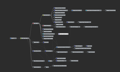
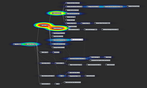
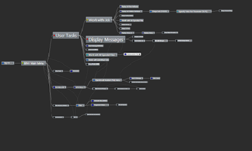
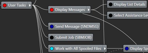
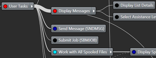
In the main graph window, each screen that a user has visited is represented as a node in the graph. The solid lines between the nodes indicate direct navigation between parent and child nodes, the dotted lines indicate indirect navigation, that is navigation between recognized nodes on different branches. Clicking a node loads its screen details in the panel to the right of the main graph window. If an override exists for a given screen, the node will be displayed with an indicator  .
.
Node context menu BACK TO TOP
Right clicking a node in the graph opens the node context menu.
![]() Open - open the current node at full screen size
Open - open the current node at full screen size
 Design - open the current node in Designer
 Identify - open the current node in Identify
 Set as Root - make the current node the root node for the graph
 Reset Usage - remove all existing usage counts for this node and any of its children
 Rename - change the node label (the node label is initially derived from the name of its associated override)
 Reorder | Up - position this node on top of the sibling node that is directly above it
 Reorder | Down - position this node on the bottom of the sibling node that is directly below it
 Delete | Node - delete this node from the graph (any children will be repositioned)
 Delete | Node Tree - delete this node and any children of it from the graph
 Area - assign this node/s to an area or create a new area.
Screen details BACK TO TOP
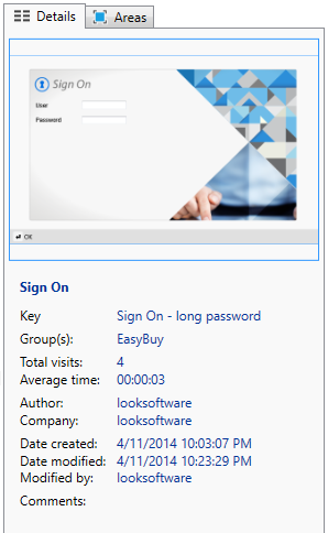
Single-clicking a node in the graph displays its screen information in the Details tab to the right of the main graph window.
This tab displays the selected node screen (as it would appear in GUI mode in Newlook Smartclient), along with additional information about the current screen node, like total visits to the screen and the average time spent on the screen.
Double clicking a node in the graph opens the screen full size (you can also do this by selecting Open from the node context menu or double clicking the thumbnail screen in the screen details panel). This allows you to view the "heat" of individual fields on the screen and open the screen in Identify or Designer.
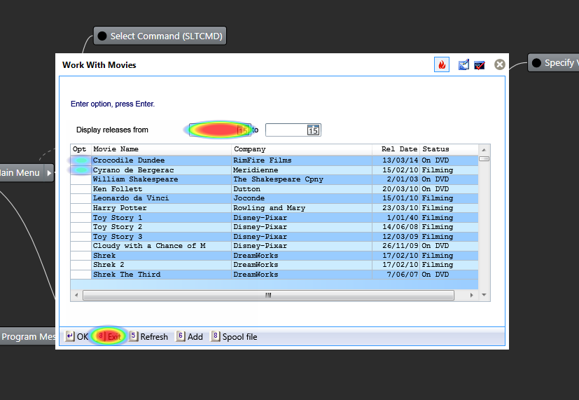
The buttons on the top right of the screen can be used to:
 toggle field heat on/off
open the screen in Designer
open the screen in Identify
Graphing toolbar BACK TO TOP
The Insights Graph toolbar provides various options for representing your imported user data.
Configure Heat
The  Configure heat options allow you to specify what "heat" will represent in your graph. The default option is Visit Count, which means that a "hot" spot represents a screen/field that is visited frequently and a "cold" spot is a screen/field visited rarely. The second option is to represent heat as Time Spent, which will assign heat to the screens/fields that users have spent the most time on. the third option is Combined, which will represent heat as a combination of Visited and time spent. It is also possible to filter nodes in the graph based on heat, using the slider in this drop down. Dragging the slider to the far left (Cold - Show more) will display all nodes in the graph. As you drag the slider towards the right, only those nodes with the specified heat or hotter (and their parent nodes) will be displayed. This allows you to filter the nodes on your graph to only those screens that have a specified visit count or time spent on them. Note that parents of these nodes will also be displayed even if their heat is less than the specified amount.
Show or hide nodes by group
The  Show/hide nodes by group option allows you to configure the group data that will be displayed in the graph. For instance, if you only wanted to display activity for the Sales department then you would select only this group.
Group Intersections
If you have imported data for more than one group, the Show intersection of selected groups option allows you to display only those screens that have been visited by all your currently selected groups.
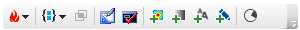
Open screen in Designer
The Open screen in Design button opens the screen for the active node in Designer.
Open screen in Identify
The Open Screen in Identify button opens the screen for the active node in Identify.
Toggle color heatmap
The Toggle color heatmap button toggles the color heatmap display. When enabled, a heatmap will be overlaid on the graph according to the heat options specified in the Configure heat drop down (see above).
|
Color heatmap turned off. |
Color heatmap turned on. |
Toggle opacity heatmap
The Toggle Opacity heatmap option toggles the opacity heatmap display. When turned on, a nodes of the graph will be more opaque if they have less heat, according to the heat options specified in the Configure heat drop down (see above). With this mode turned on, screens with more usage will display clearer on the graph.
|
Opacity heatmap turned off. |
Opacity heatmap turned on. |
Toggle font heatmap
The  Toggle font heatmap button toggles the font heatmap display. When turned on, "hotter" nodes will be displayed with a larger font than "colder" nodes, according to the heat options specified in the Configure heat drop down (see above).
|
Font heatmap turned off. |
Font heatmap turned on. |
Toggle line thickness heatmap
The Toggle line thickness heatmap button toggles the line thickness heatmap. When turned on, "hotter" navigational lines will be displayed thicker on the graph according to the heat options specified in the Configure heat drop down (see above).
Line thickness heatmap turned off. |
Line thickness heatmap turned on. |
80/20 rule BACK TO TOP
The The 80/20 Rule tool allows you to identify those screens in your application which experience most of the user traffic. The tool is based on the assumption that 80% of user activity is spent in 20% of application screens. Therefore to optimize application modernization, a good place to start are those 20% of screens with the highest activity.
There are two ways that you can report activity - screens visited and time spent.
The Visit count tab will return the top 80% most visited screens, in order of most visited. You can vary the user traffic percentage if you wish to return the top 90% or top 50% for example. Clicking Export will output the current query results as a .csv file.
The Time spent tab will return the top 80% screens where most time was spent, in order of time spent. You can vary the user's time percentage if you wish to return a different percentage. Be aware that the time spent statistics can sometimes be blown out if a user has left a screen open and unattended during the initial recording - for instance if they had a particular screen active and went to lunch. In most cases, visit count is a more accurate way of identifying screens with the most activity. Clicking Export will output the current query results as a .csv file.
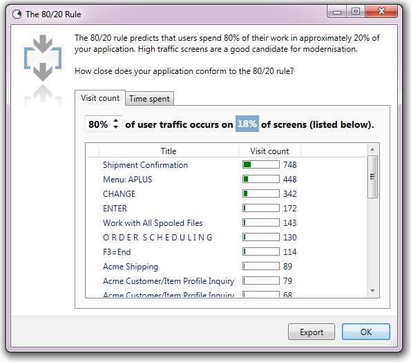
TIP:
Single clicking a screen in the 80/20 list will select that screen node in your application graph. Double clicking a screen in the list will open it in Identify.
Search bar BACK TO TOP
Use the search bar to locate a node (by its key) in the graph. This can be handy if you have a large application graph with hundreds of screens.

Areas tab BACK TO TOP
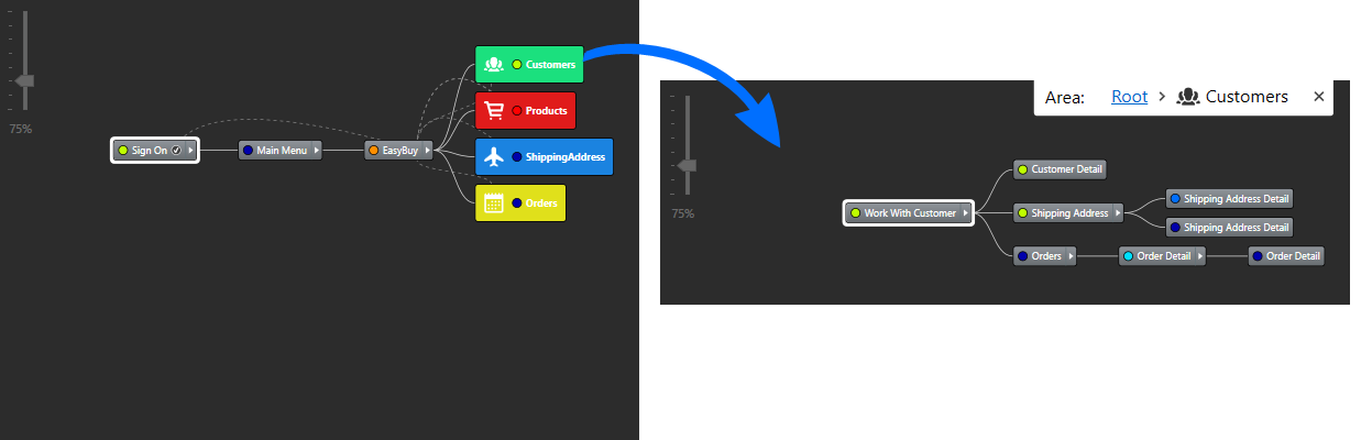
This tab allows you to add, edit and remove Area modules. Areas allow you to simplify your Insights graph by grouping various screens in your application under a single module. Nodes belonging to an area are hidden until that area module is expanded. This makes it far easier to view complex applications that may have many hundreds of screens - you can view each area of your application separately. To group nodes into areas, you will first need to define your custom areas.
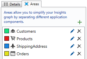
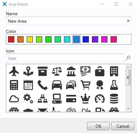
Click the Add button ( ) to add a new area. Click Edit () to modify its name, color and icon (optional).
Once you have created an area, you can assign a node to that area by right clicking it and selecting the relevant area from the context menu. To add multiple nodes to an area, SHIFT+click or CTRL+click to select multiple nodes before assigning them to an Area. As soon as you assign a node to an area it will disappear from the screen and you will only see the area module on screen. Click an area to view all the nodes within it. To get back to the top-level view, click the Root link in the Area breadcrumb at the top of the screen.
Navigation map BACK TO TOP
The panning map can be used to quickly select an area of your graph to display in the main window. Use your mouse to move the display box to the desired position. Use this in conjunction with the zoom slider in the top left corner of the graph window to display the desired range of nodes.
See Also
What is Newlook Insights | Recording user data | Importing recording files